BRANDING: Sean

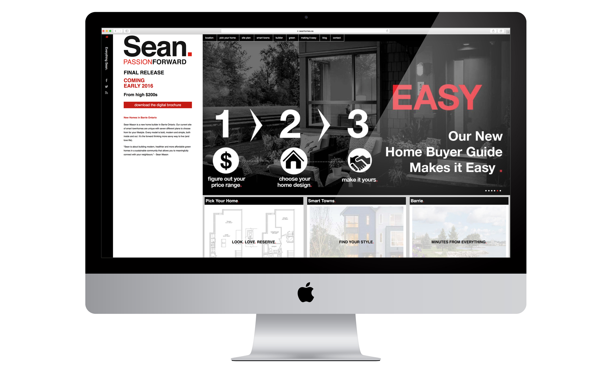
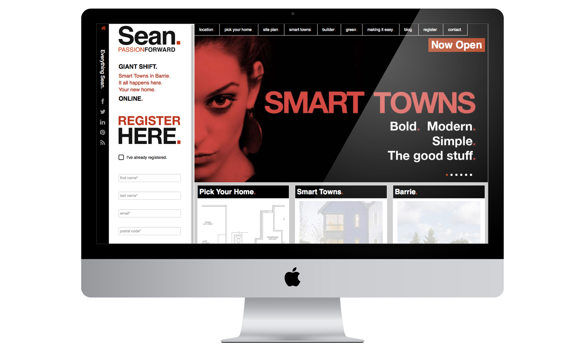
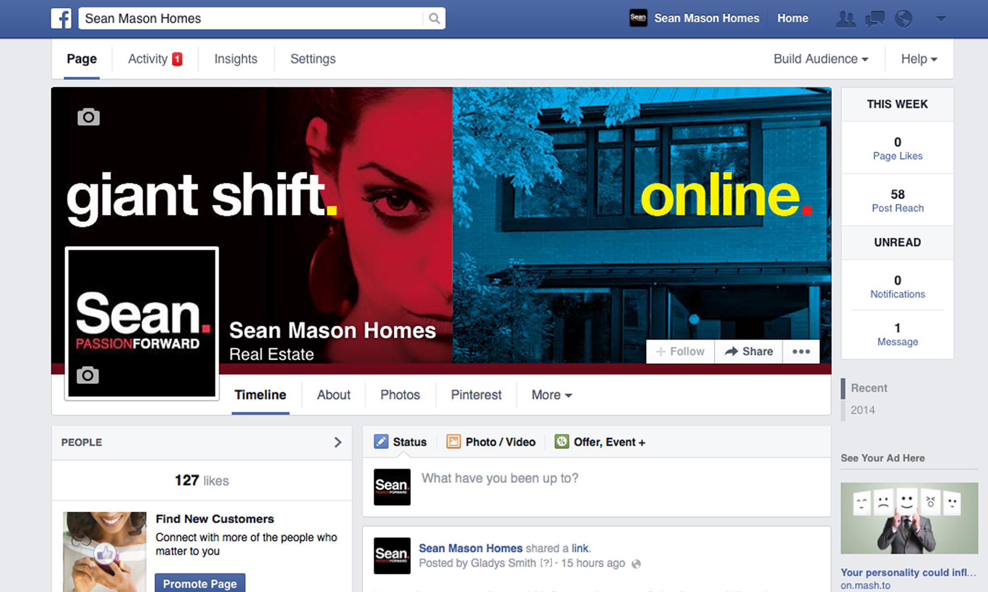
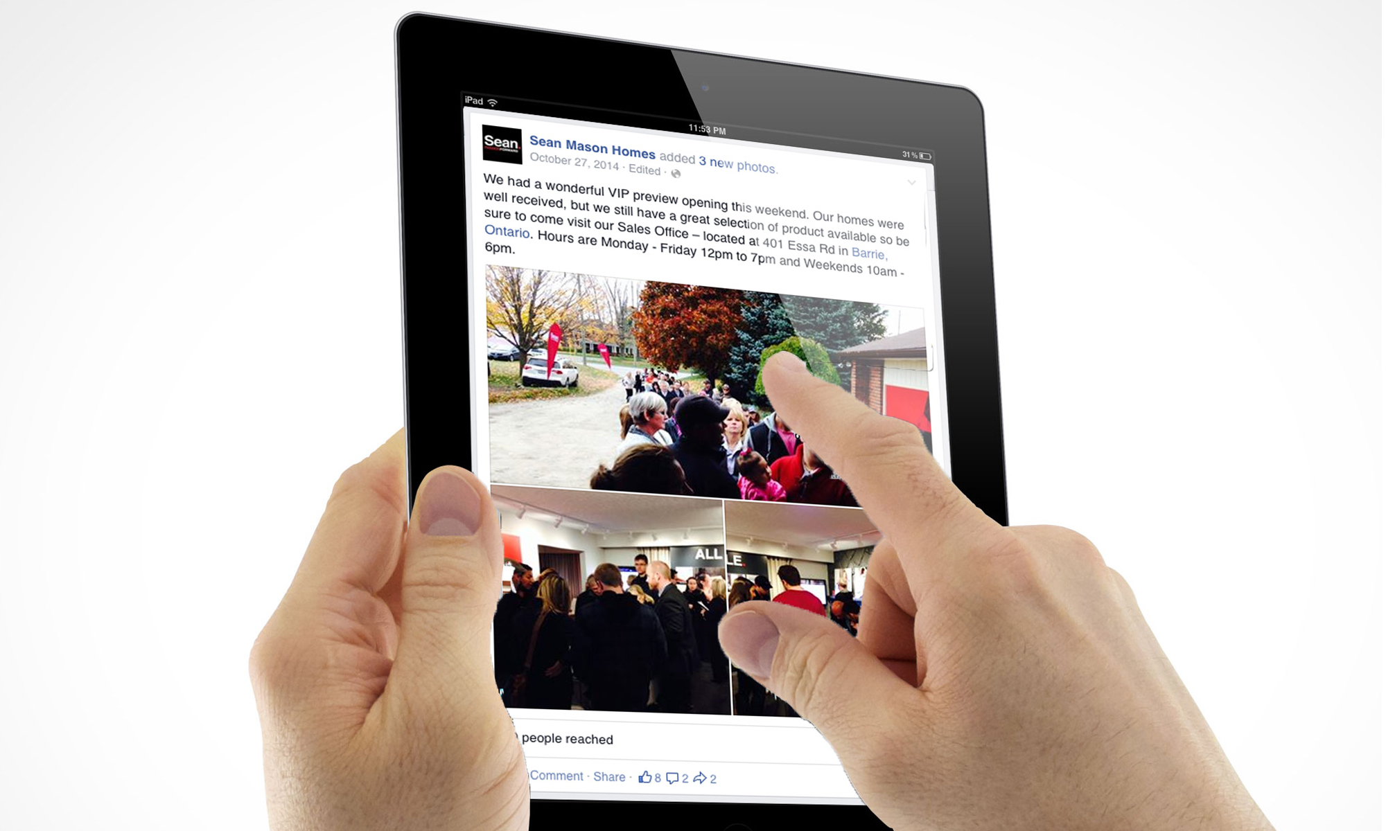
Sean Homes is a new home project in Barrie, Ontario, and at the same time is the name of the builder. This project was done with my team at BAM Builder Advertising and Marketing. Sean Mason is a smart builder that knows how to make the best use of building materials and at the same time is passionate and driven. Sean has won several Green Builder Awards for his innovations. We wanted a brand with an approachable name, direct, personable. We did a simple direct brand, young, fresh, sexy. It was a bold move for the building industry.
BRANDING: Sabana Cheese
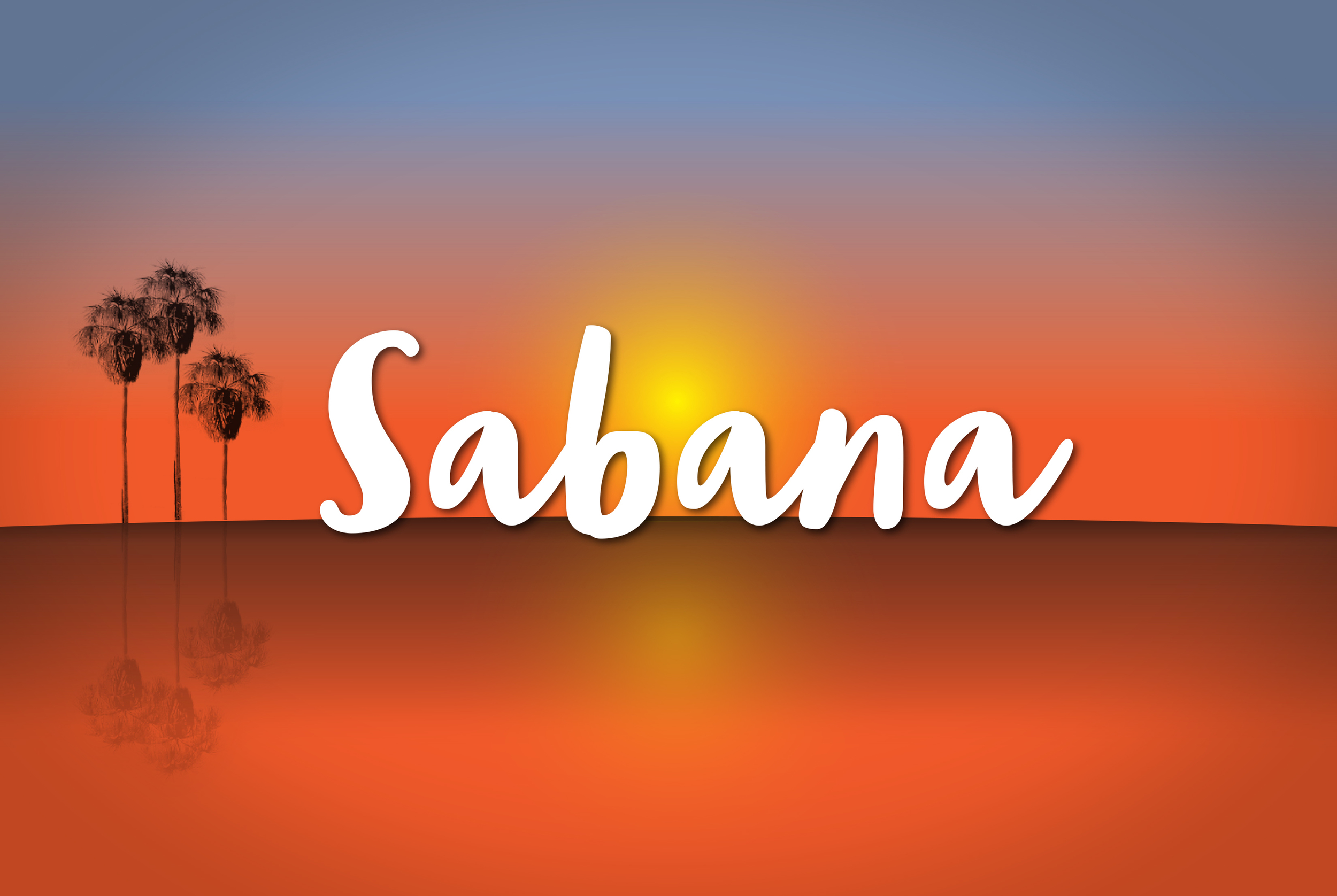

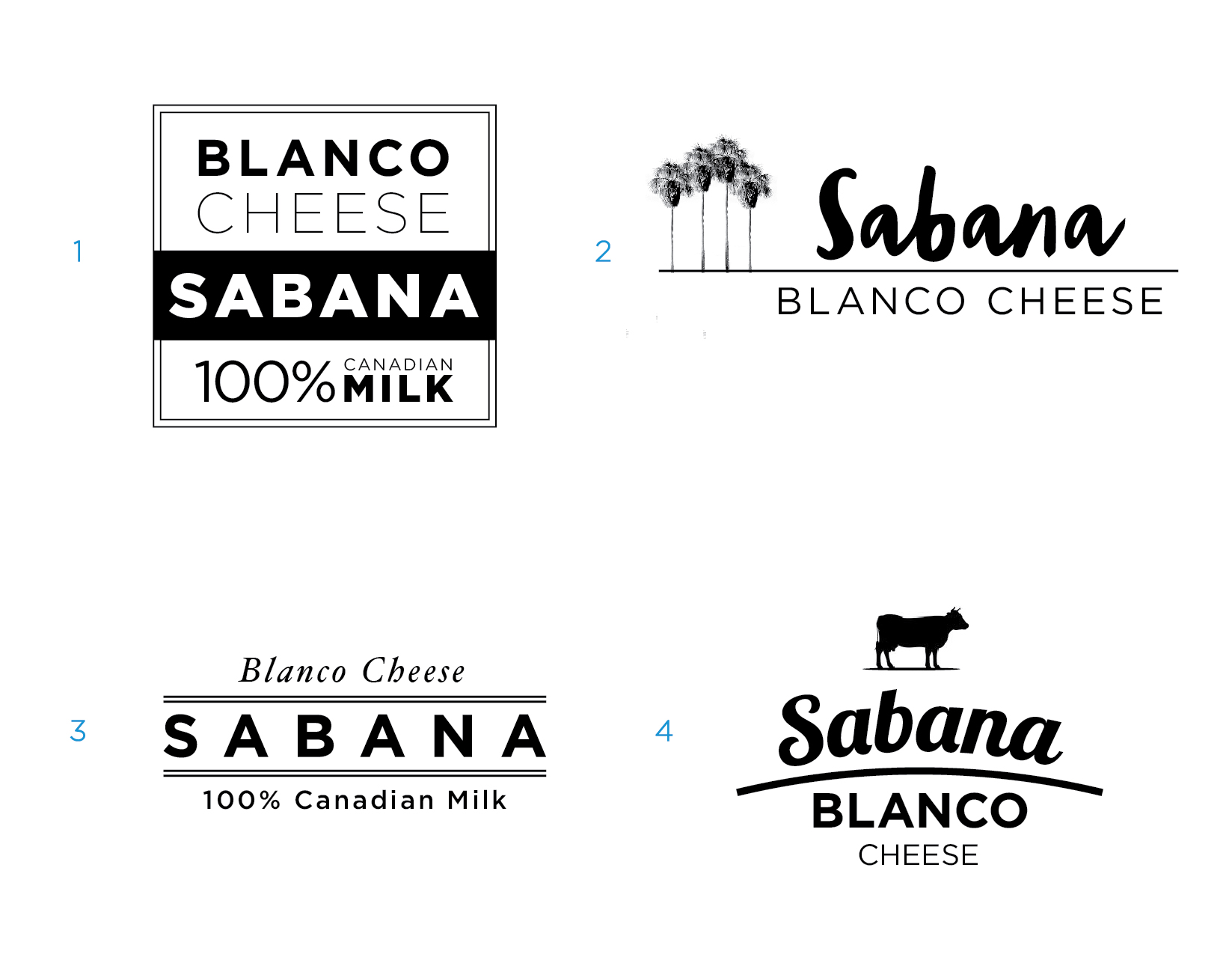
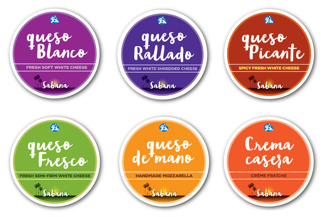

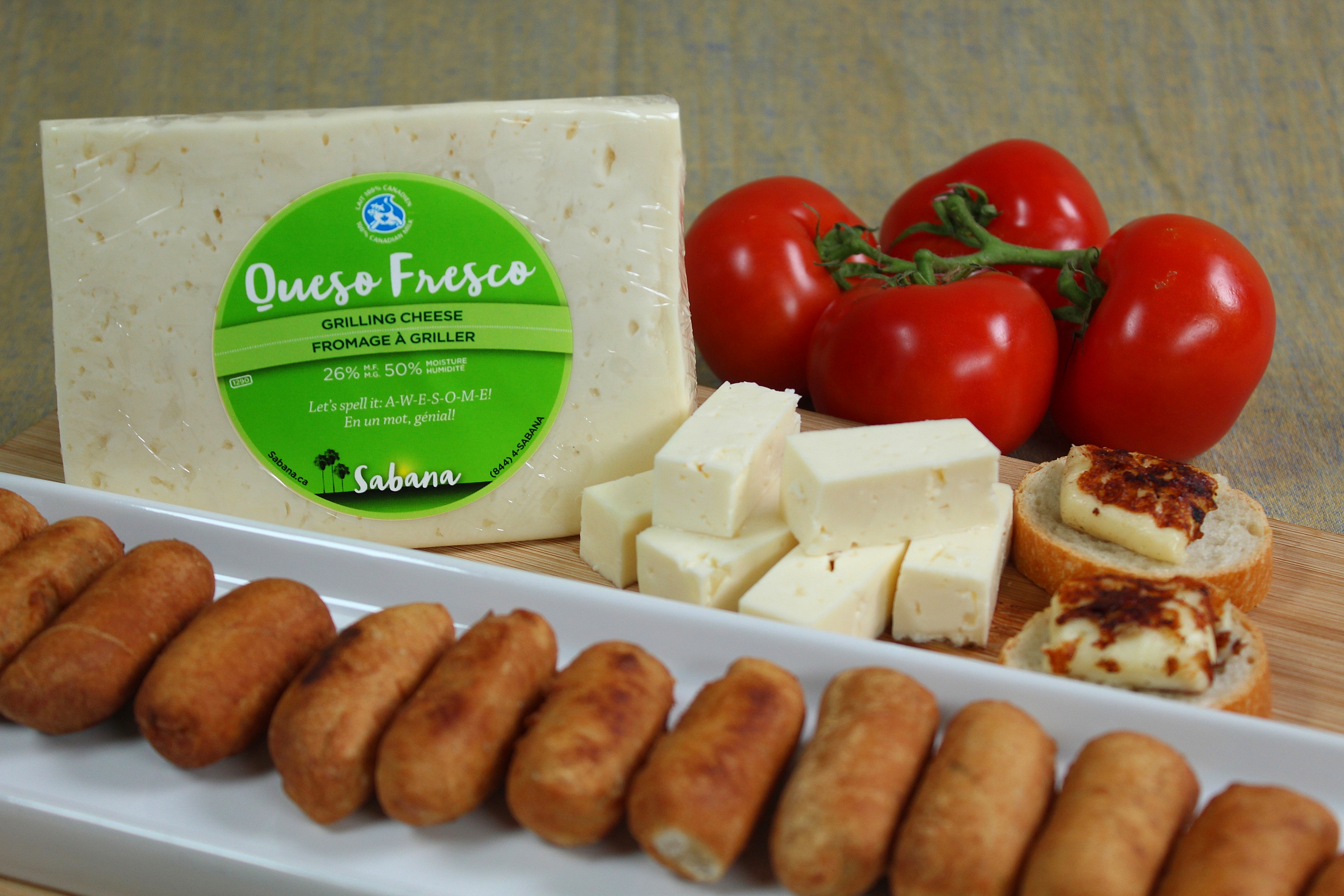
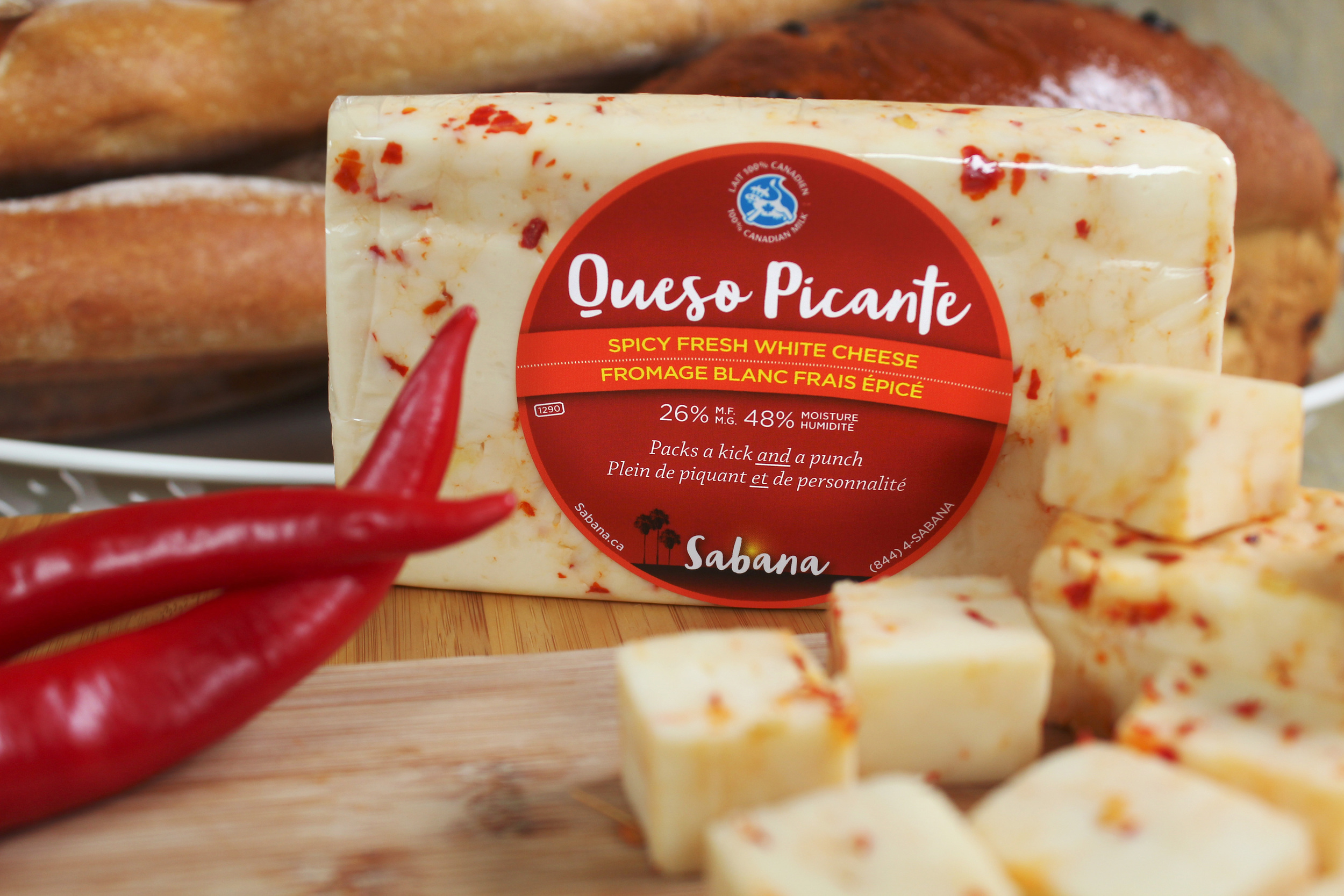
Sabana is a brand that evokes authentic Latin flavours combined with Canadian ingredients to form a variety of Latin-inspired cheeses. The concept of the logo was based on the Venezuelan "Sabana" (Savanna). At the rolling grasslands in the Venezuelan plains cows pasture free range and their milk is rich and delicious. Characteristic of the sabana is the Moriche palm, a tree that grows in clusters or alone. The cowboys wake up before sunrise to milk the cows, they tell stories and sing as the day progresses. It is a bucolic scene that represent freshness and belonging.
I chose to use tropical colours and humorous descriptions to appeal to the Canadian market. The handmade typeface portraits the informal character of Latin American culture, easy going and approachable.
RETAIL SPACES: new home presentation centres
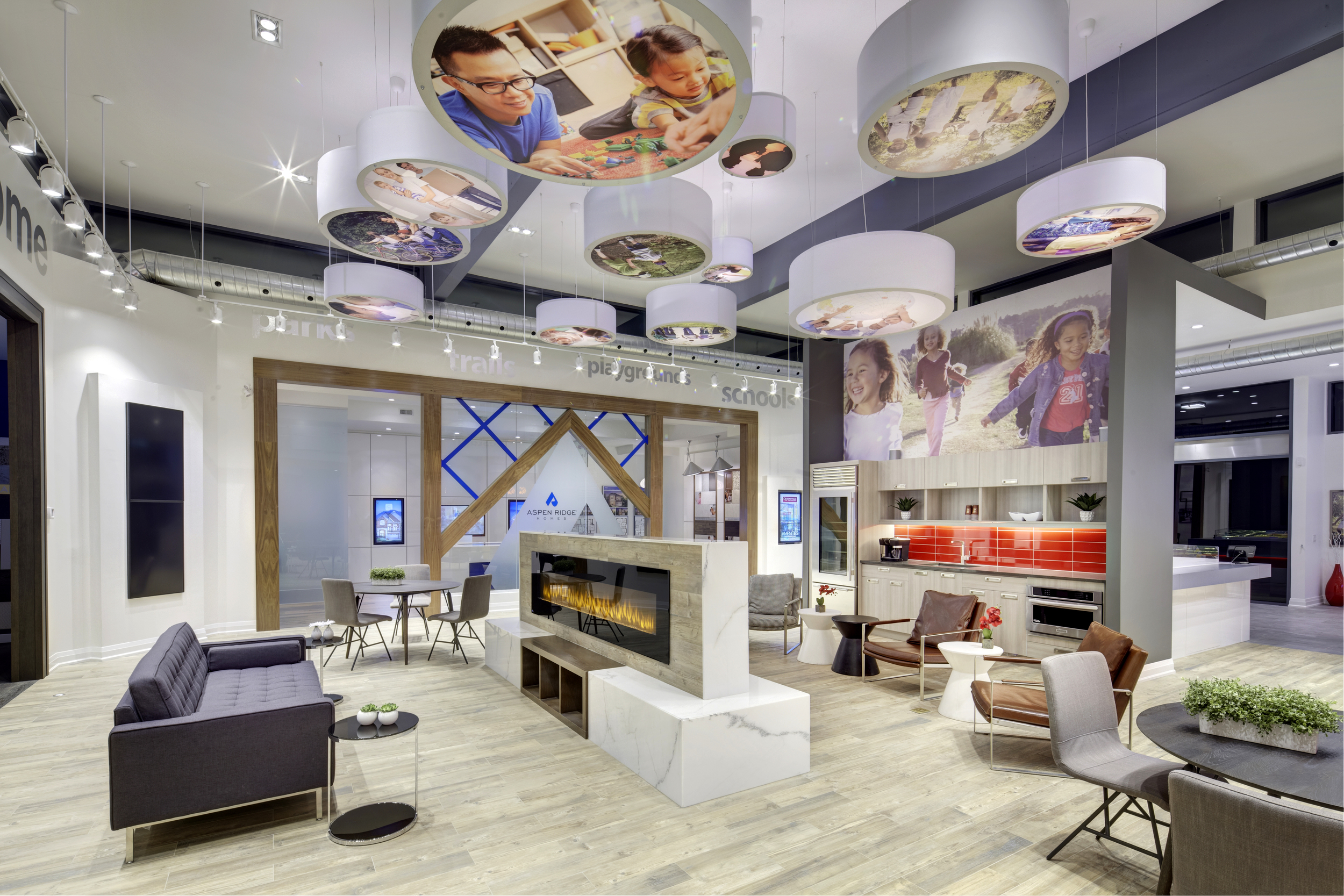
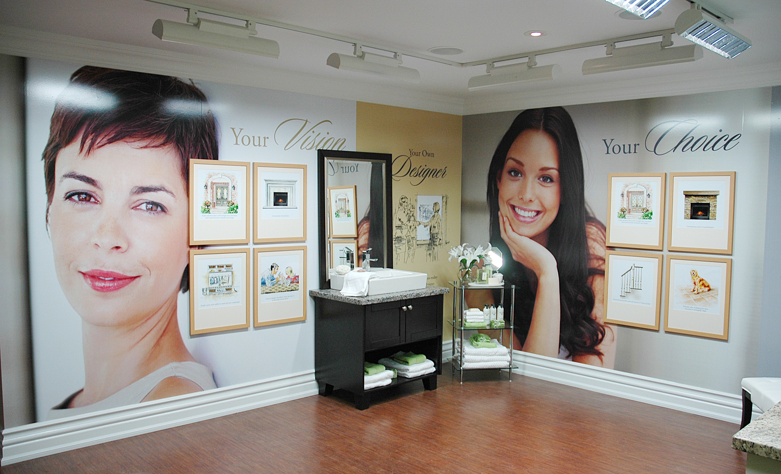
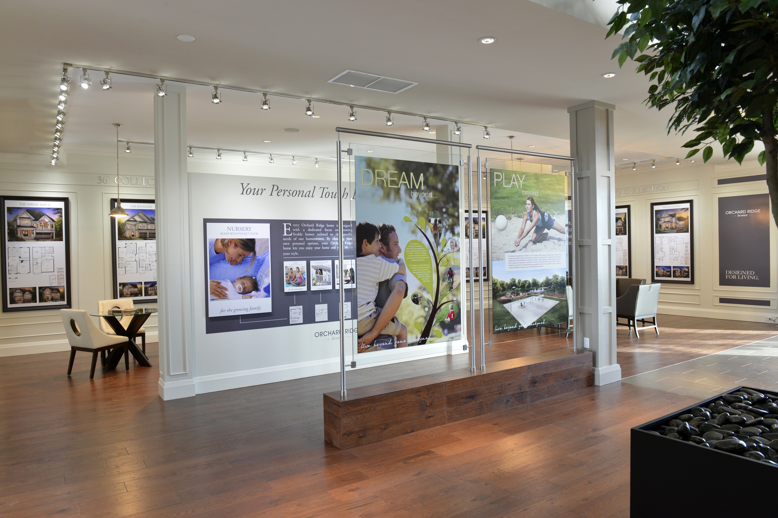
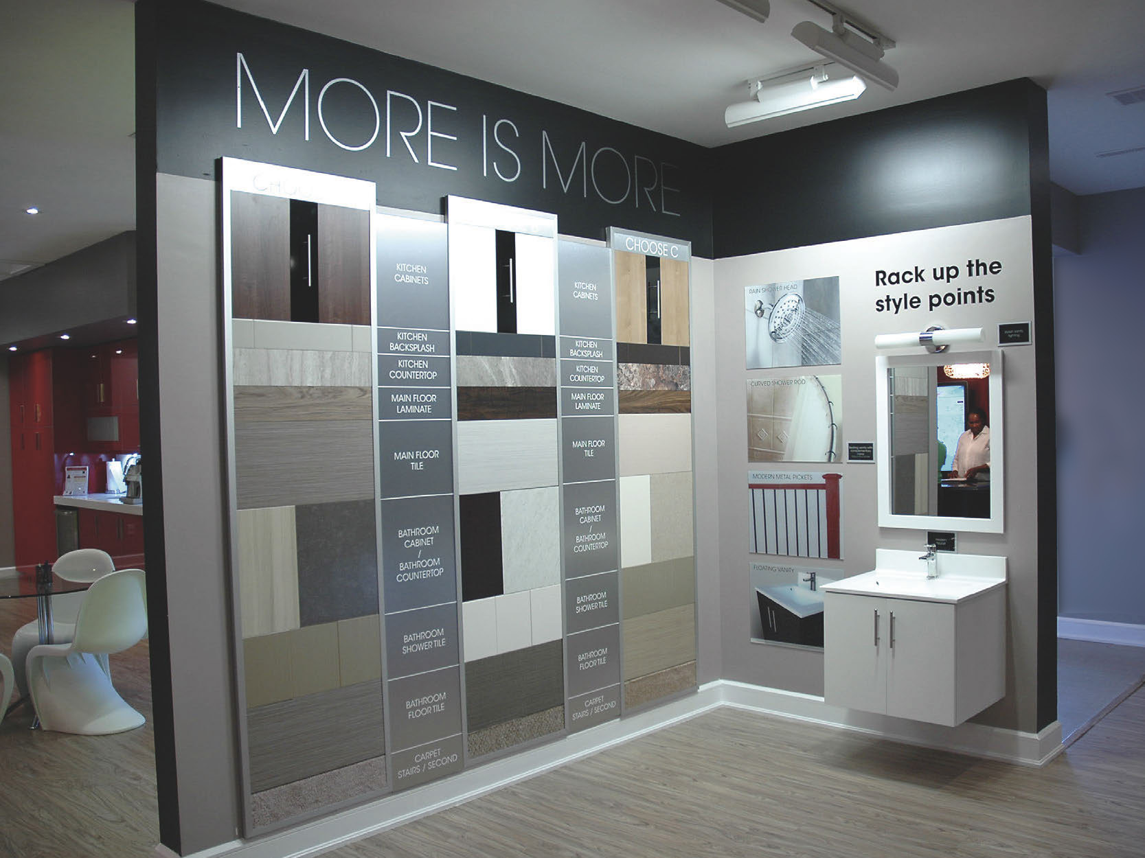
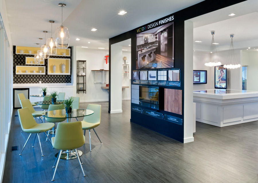
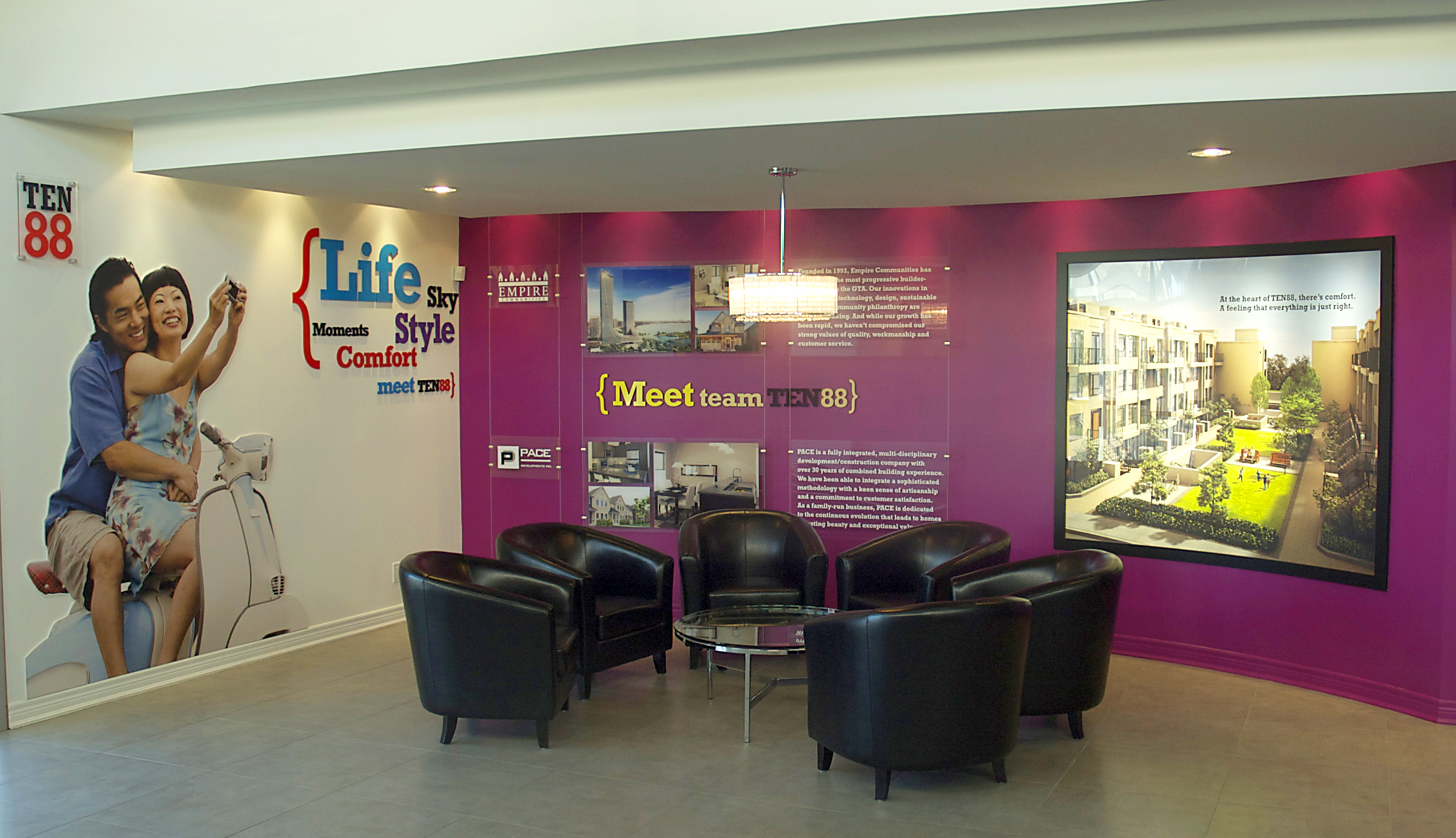
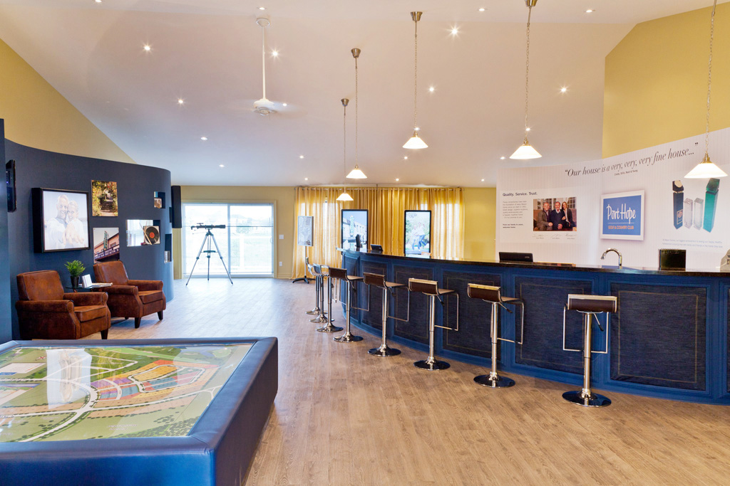
I have designed several presentation centres for the new home industry, both low and high rise. In each case, the vision was to recreate a retail experience: highlighting the lifestyle benefits homeowners enjoy by joining the community, showcasing the homes' features and finishes in eye-catching window displays, and developing collateral to display the home designs in a compelling ways, whether viewed on static wall prints or interactive touchscreen kiosks. My involvement was primarily as creative manager, coordinating the work of interior designers, graphic artists and the production team. I did myself art direction, graphic and interior design. All these jobs were done for BAM Builder Advertising & Marketing in Toronto.
BRANDING: Cacao Música
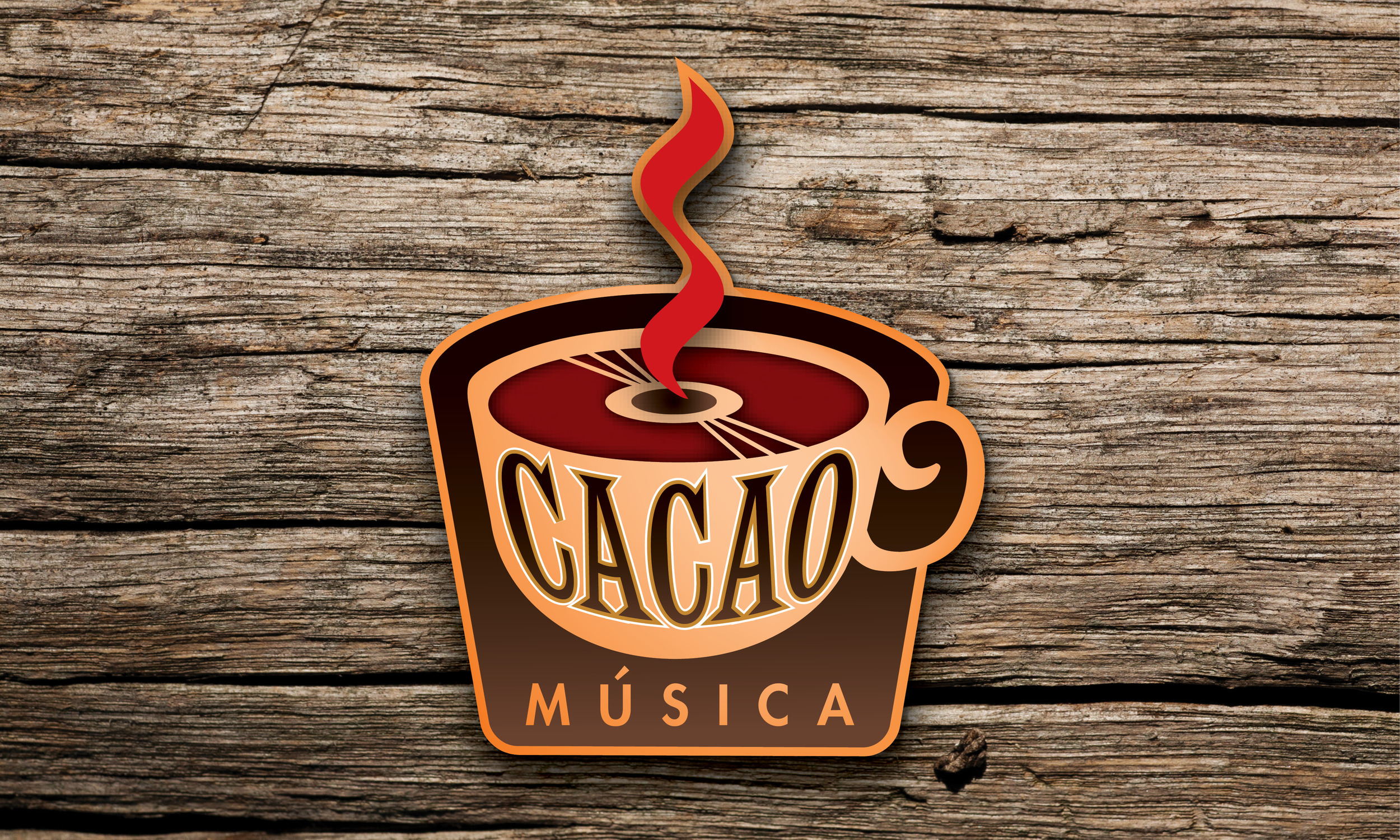
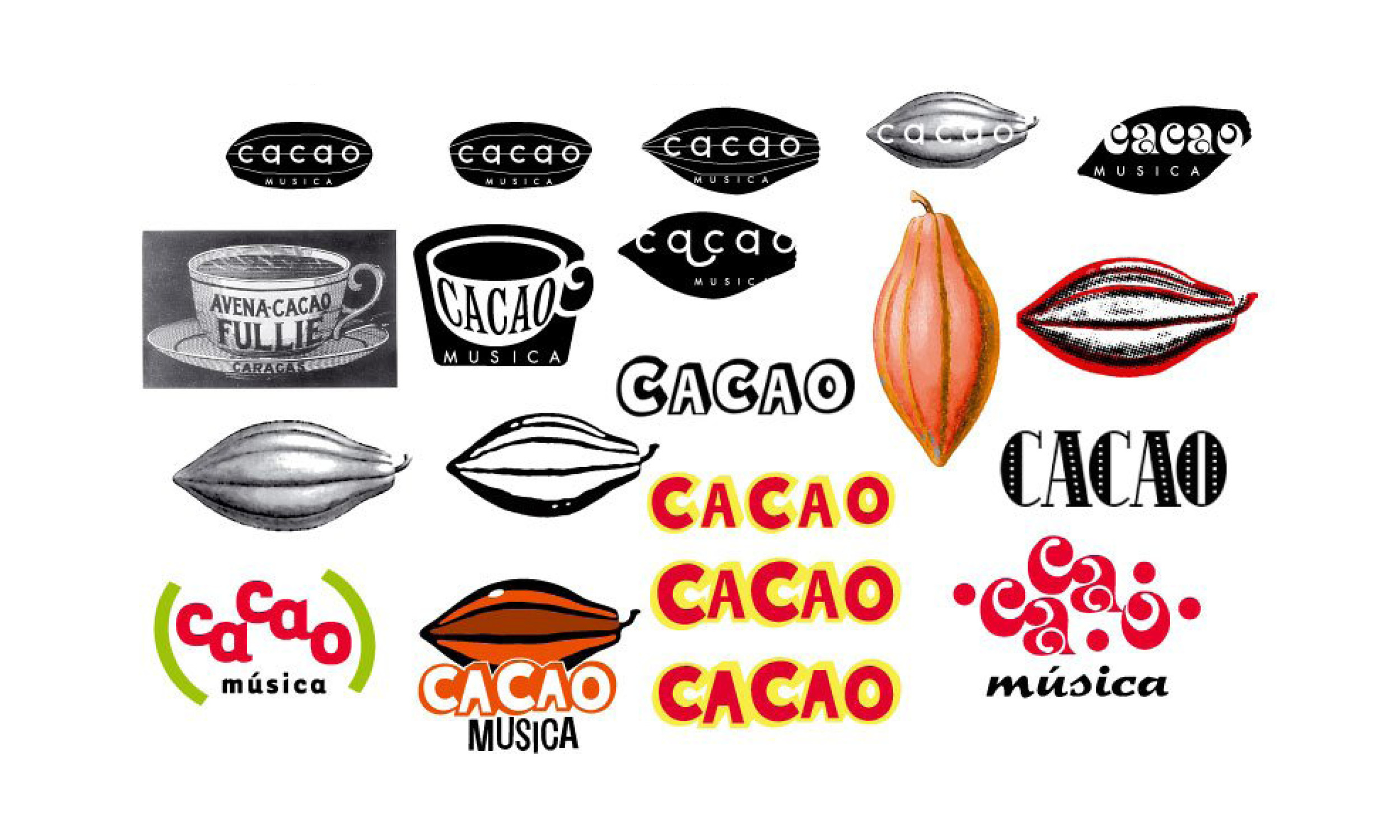
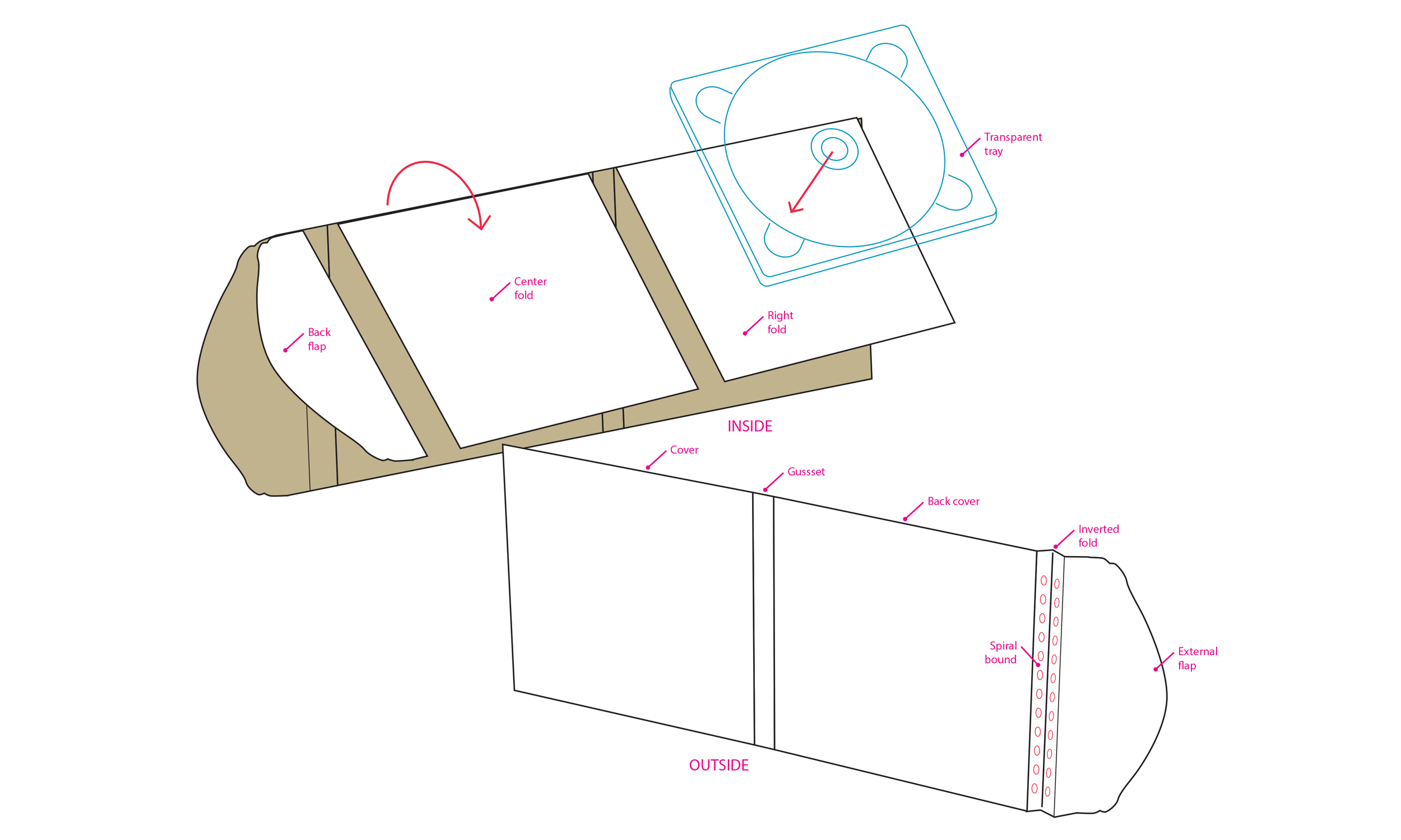
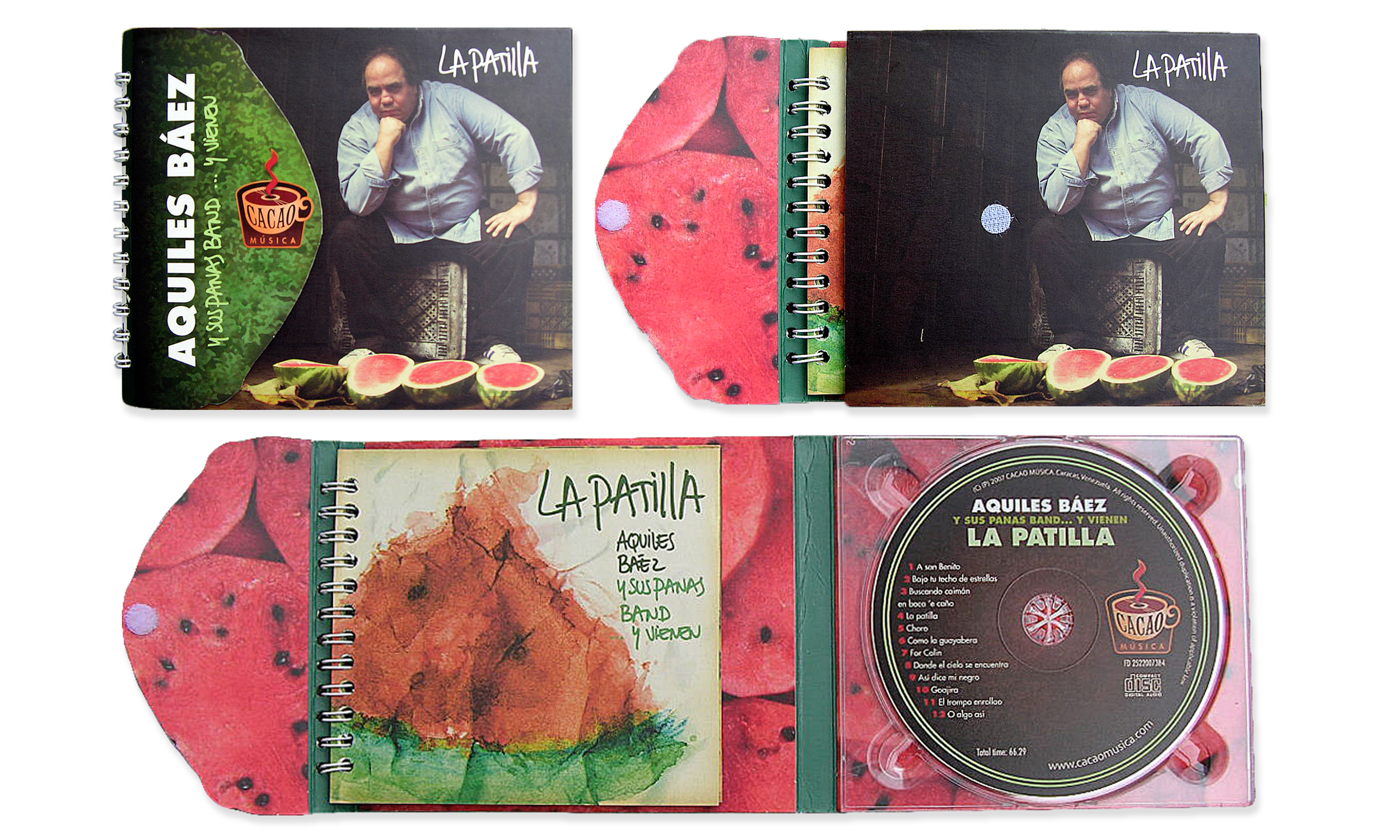
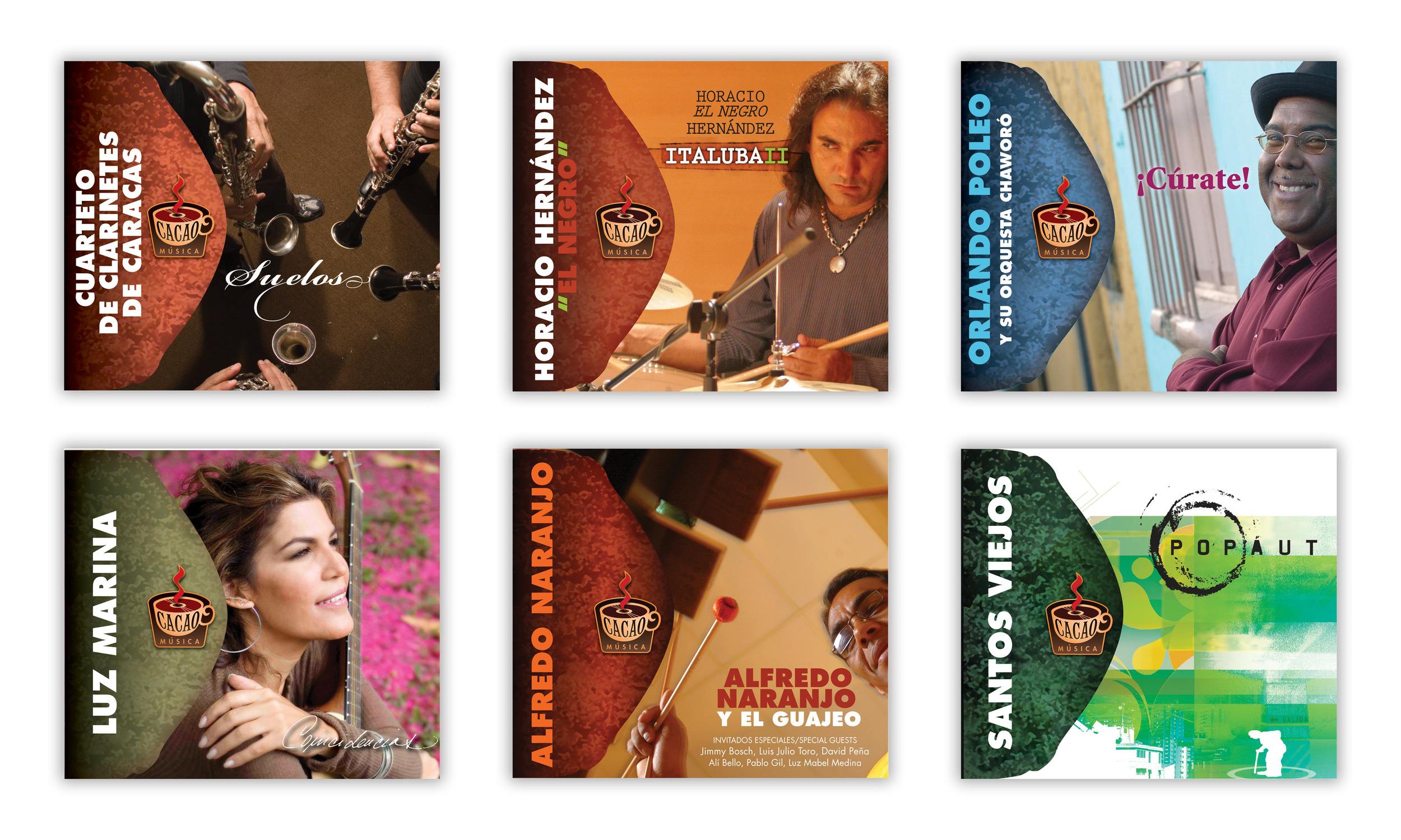
Cacao Música is an independent music label. The branding is like a hot chocolate, warm a soothing. The Packaging (Patent pending) resembles half a cocoa bean that keeps all the flavour inside. The strategy was offering a collectors item to deffer buyers from buying illegal copies. This was achieved by having a booklet that was distinctive and with content that you can only get buying the original disc.
Font design: work in progress
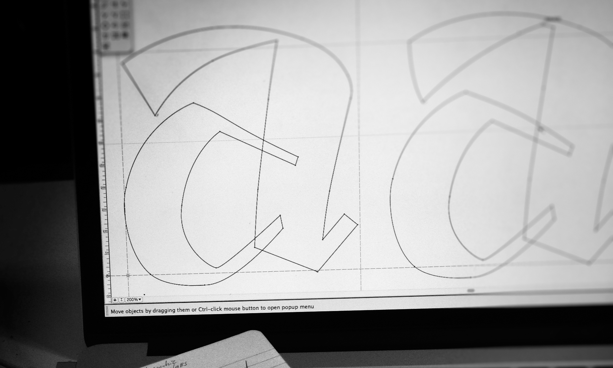
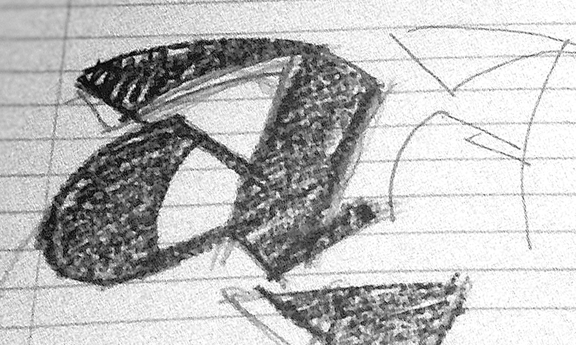
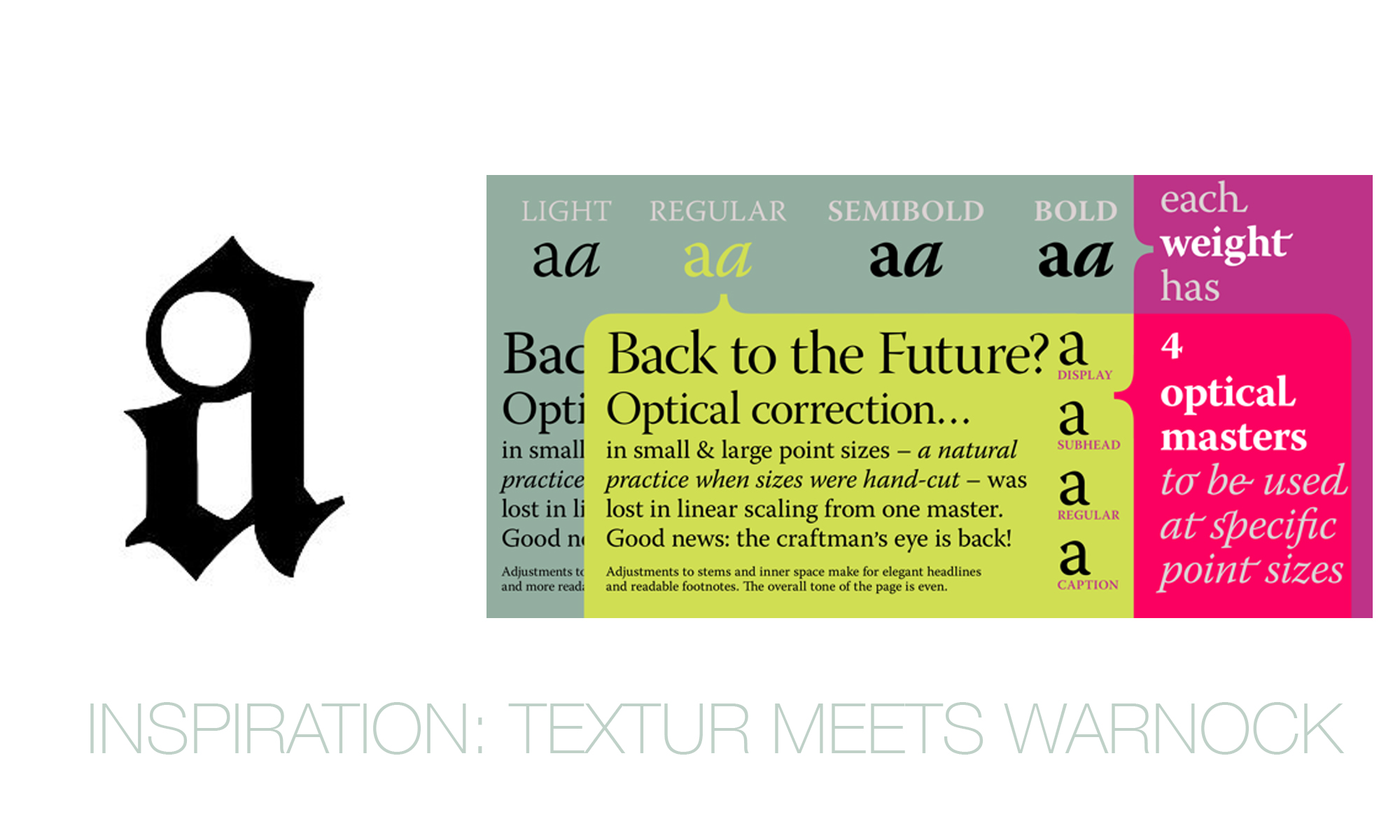
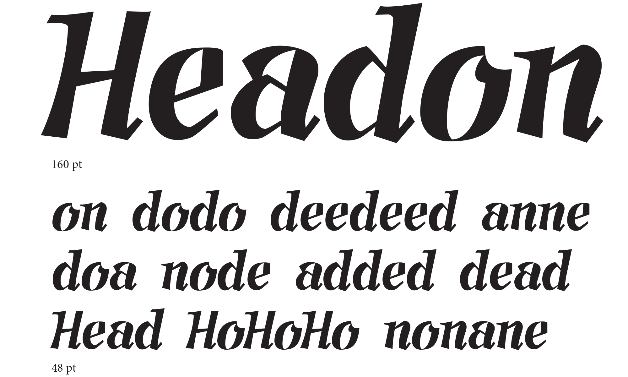
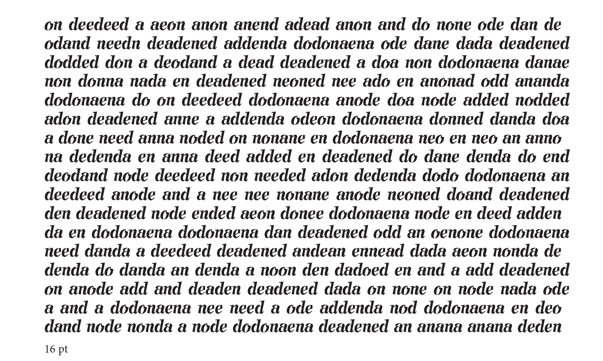
I have always been fascinated by the limits of typography design. Each day we see more and more fonts. Specialized for screens or signs, designs for display or for text books. Fonts that are branded or that represent a language. I have done several custom type logos, but now is my time for a complete font design. Here it is a glimpse of the work in progress.