• Videos
  • Bio
  • Testimonials
  • Contact
Menu

Jacinto Salcedo

Branding & Marketing
  • Videos
  • Bio
  • Testimonials
  • Contact

Ink Trap is a blog by Jacinto Salcedo featuring works of typography.


Ink Trap archive

Ink trap -Blog-
I met THE MET
I met THE MET
about 9 years ago

I love the controversy behind the launch of the new branding for The Metropolitan Museum of Art in New York. It shows how much we care about brands.

Why does big type make us happy?
about 9 years ago

There is something appealing about standing side-by-side big type. We get silly and want to be part of that word. I have a couple of theories about that.

Shadow letters by Nedo MF, 1969
about 9 years ago

Letras sombra was part of the Alfabetos imposibles (Impossible Alphabets), a series of typographic experiments made by Nedo M. F. in the 60's and 70's in Caracas, Venezuela.


I met THE MET

March 09, 2016
I met THE MET

I love the controversy behind the launch of the new branding for The Metropolitan Museum of Art in New York. It shows how much we care about brands.

Read More
Tags: #THEMET, #newlogo, #newyork, #brand, #logo, #willemdafoe

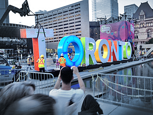
Why does big type make us happy?

March 08, 2016
Why does big type make us happy?

There is something appealing about standing side-by-side big type. We get silly and want to be part of that word. I have a couple of theories about that.

Read More
Tags: Type, Typography, Graphic Design, Toronto, Amsterdam, Hollywood, 3D sign, Big type

Shadow letters by Nedo MF, 1969

February 29, 2016
Shadow letters by Nedo MF, 1969

Letras sombra was part of the Alfabetos imposibles (Impossible Alphabets), a series of typographic experiments made by Nedo M. F. in the 60's and 70's in Caracas, Venezuela.

Read More
Tags: #nedo, #designhero, #impossibletype, #typography, #venezuela
Back to Top